In all the previous discussion we have used linear scales. Another option is to use a logarithmic scale. This is often used when there is a need to display both very small and very large values in the same graph. The library supports the use of logarithmic scales on both the x- and y-axis (as well as the optional extra y-axis).
The logarithmic scale support is defined in the module file
"jpgraph_log.php" so this must be included in order to
access this feature.
To illustrate the use of a logarithmic scale we will make a graph which uses two
y-axis and make the second y-axis have a logarithmic scale (we will actually take
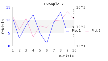
the graph in Figure 15.16. Adding and adjusting the position of the legend box ( and change the second y-axis to be a
logarithmic scale instead).example6.php)
In order to use a logarithmic scale on the second (Y2) axis we only need to change
1 | $graph->SetY2Scale('lin'); |
to
1 | $graph->SetY2Scale('log'); |
and the library will take care of the rest. The result of this is shown in Figure 14.59. Changing the Y2 scale from linear to logarithmic ( example7.php)
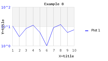
By default only the major grid lines on the y-axis are shown. By adding the lines
1 2 | $graph->ygrid->Show(true,true);
$graph->xgrid->Show(true,false); |
We can enable both the x-grid lines as well as the minor grid lines on the y-axis
to get the result shown in Figure 14.60. Enabling minor grid lines on the y-axis and also grid lines on the x-axis ( belowexample8.php)
Figure 14.60. Enabling minor grid lines on the y-axis and also grid lines on the x-axis ( example8.php)
In addition to using a logarithmic scale on the y-axis to generate what is
commonly known as a "lin-log" scale it is also possible to use a logarithmic scale
on the x-axis to get a "log-log" plot (as is often used in electrical engineering).
An example of this is shown in Figure 14.61. An example of a log-log plot (where both the y- and x-axis use a logarithmic scale) ( loglogex1.php)
Figure 14.61. An example of a log-log plot (where both the y- and x-axis use a logarithmic scale) ( loglogex1.php)
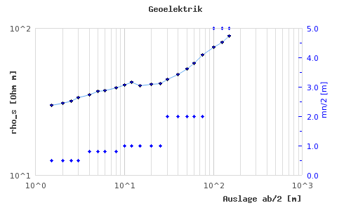
Note
The example in Figure 14.61. An example of a log-log plot (where both the y- and x-axis use a logarithmic scale) ( also makes use of
scatter plots which we have not yet introduced but is a way to draw a plot
of a number of data points specified by both there x- and
y-coordinates.loglogex1.php)
Tip
If you think the first value of the Y-axis is to close to the first label
of the X-axis you have the option of either increasing the margin (with a
call to SetLabelMargin() ) or to hide the first label (with a
call to Axis::HideFirstTickLabel() )
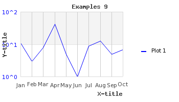
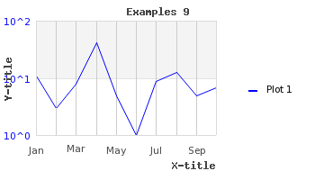
As a final example of using a logarithmic scale we show how to combine a text
scale for the x-axis and a logarithmic scale for the y-axis. As we already shown in
Graphing the number of sun spots during the 19th Century it is possible to manually specify
the labels that should be used on the axis with a call to Axis::SetTickLabels().
Let's make use of this and the built-in library super global variable
"$gDateLocale" which is an instance of a date utility class to get
a list of the name of all the months in a localized fashion.
To use the name of the months on the x-axis we haev to add the following two lines to the previous example
1 2 3 4 | $montnames = $gDateLocale->GetShortMonth(); $graph->xaxis->SetTickLabels( $montnames ); |
The result of adding these two lines are shown in Figure 14.62. Using a text-log scale ( belowexample9.php)
Since the name of the months are quite close we can change what labels should be
displayed as was discussed in Manually specifying scale labels to
only show every second label. Doing this change gives the result shown in Figure 14.63. Adjusting the text scale so that only every second labels are displayed. ( example9.1.php)
Figure 14.63. Adjusting the text scale so that only every second labels are displayed. ( example9.1.php)
Another option if we think that the labels are too close is to rotate them. In
Figure 14.64. Rotating the x-axis labels 90 degree ( we have kept all labels but rotated them 90
degree.example9.2.php)

Caution
Remember that the built-in bitmap fonts only supports 0 and 90 degree text. TTF fonts support texts at an arbitrary angle.